Sunday, January 20, 2013

Adventures in luthiery - themed dulcimers


Luthiery is the art of making plucked and strummed stringed instruments, though some include the bowed strings in that category also.  I started out many years ago making instruments in the foolish hope of finding work that would be appreciated for its usefulness.  Like Flaubert, I was torn between a love of art and a yankee (or was it Scottish) inclination toward austerity and practicality.   I thought luthiery would satisfy the drive to design and make things.  This was a mistake, of course, because I put so much time into making them interesting that I could not possibly earn a living.  I made a classical guitar and started a violin, but the predetermined form bored me.  The dulcimers offered an opportunity to design more freely, and so I continue to make them once in a while.  The latest in progress is related to the drawings from last summer of Verrocchio's putto fountain (June or July 2012). It will have a putto dancing on the peghead holding a small instrument instead of the dolphin.  This will work well with the traditional heart-shaped sound holes.

These illustrated above are older instruments made many years ago.  The Scottish Lion dulcimer was inspired by an incised image on a rock in Scotland from prehistoric times.  The sound holes are drawn from the Scottish flag.  The peghead, fingerboard, sides, and back are made of walnut wood,  the pegs are rosewood, and the soundboard is Englemann spruce.   I think I may have misspelled that.  They are entirely make with handtools.  The back is slightly bowed and the seam worked until you could not see a single ray of light through it when held together dry.  The joint is invisible except that the grain suddenly turns into its mirror image.  So the whole thing took 3 weeks to make working almost full-time.  I seem to have a habit of seeking out labor intensive projects.

The Rascal is made with cherry with ebony pegs.  The sound holes are oak leaves and the acorn contrasts a nice smooth surface with the rough fur of the squirrel rendered with the marks of the gouge. The squirrels eyes are ebonized along with the interior of the pegbox and the vertical edges of the soundholes. The finish on both of these instruments is French polish, another difficult and time-consuming process.

I ultimately opted for teaching as a way to contribute to civilization and earn a living.  So now I can do as I wish when it comes to art without the need to earn a living by it.  With such freedom, I chose to spend more time with 'fine art' and not the craft of luthiery.  And now I need not consider the excessive time spent carving, building, drawing, painting, plucking strings, etc. except insofar as that simultaneous urge for utter simplicity wages war in my soul.  Leonardo said "It should be our pleasure that our days be not squandered nor suffered to pass away in vain, and without meed of honour, leaving no record of themselves in the minds of men", and "I wish to work miracles." The desire to leave a mark, something to be remembered by that is deemed admirable, comes up against the understanding that such desire, among others, is the root of suffering.  The Buddhist ideal is to leave this world with no evidence of your having been here.  "There are no footprints in the sky."  Perhaps that can wait for another lifetime.

Monday, January 14, 2013

Leonardo in a fossil rock - a pareidolon


The other day a friend called all excited over finding a fossil that looked like Mona Lisa.  She knew I liked pareidola, fossils, and Leonardo.   Here they were all in one.  Isn't it fun when nature paints a picture, or in this case carves one?   When I saw it I thought she was daft.  If that's Mona Lisa, the girl needs some help.  I see an old balding guy with a very bushy beard.  His hands are visible along the bottom, the left hand holds a large bone.  I was greatly relieved when the fossil finder called again to see how I liked the image of Leonardo in the pose of Mona Lisa. Or, she says, maybe it's Moses.  Either is more believable.  But to me the creepy crinoid eyes make him look like an alien.  

Wednesday, November 21, 2012

Four Cats Visit the Sites of Duccio's Maesta Altarpiece


This is a set of small canvases that started a series in which the settings of old paintings or prints, mostly Italian Renaissance, were stripped of their figures, and other people, or in this case cats, enter the spaces to look around like tourists visiting an alternate universe.  In this case, the four cats visit the place of the washing of the feet (upper left), the site of the denial of Peter (upper right), the appearance before Pilate (lower left), and in the lower right, Four Cats Eat up the Leftovers at the Last Supper.  They were painted many years ago and several years have passed since the last of the cats died in extreme old age. Tempus fugit and I am not getting things done.  I work constantly, but the fall semester is always a challenge.  This is a brief break and a bit of whimsy to keep the blog alive.  

Wednesday, October 10, 2012

Solitude and Lastingness


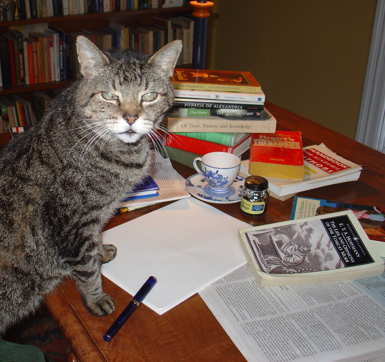
Here is Murr, my cat who died about 5 years ago, caught in the act of writing a book.  He was with me for 21 years, a large part of my life.  He was an intelligent cat and a good companion.  It's a commonplace that creative people prefer the company of cats to dogs.  Cats allow you to concentrate on work.  Usually.  My current cat, Leonardo, is good company too, but he doesn't quite measure up to Murr yet.  Leo is more demanding and Murr could keep you company while leaving you to do your thing. You could also say that Murr had lastingness, an intelligent and active kitty to the end.  He was the equivalent of 118 years old.

I've recently read two books, Solitude by Anthony Storrs and Lastingness by Nicholas Delbanco.  They had been on my to-read-some-day list for some time, but I did not know that one would speak to the other and quote it so much.  They both deal with the life of creative people.

Solitude investigates the need of some people for a way of life that most people today find puzzling and unattractive, and even judge it to be an unacceptable choice even for others, that is the inclination to be alone, to read, to think, to create, to make things or solve problems.  We live in a society that more and more values the outgoing charming personality and team activities over the introspective and solitary person.  Storrs inspects the lives of many famous creative people in history who would fall in that latter category.  He thinks the prejudice against such people may waste much of human potential.  You can see it in action when the college scholarships all go to those who can command leadership roles and win elections in the personality contests of political positions.  Emily Dickenson and even Albert Einstein would lose out in this competition.

The other book, Lastingness: the Art of Old Age, was about the question of creativity in old age.  The common wisdom is that new ideas and innovation in the arts and science are the work of the young.  We cease to create in mid life.  This is also just a cultural prejudice.  The many examples he explores can be inspirational, which is why I had it on my list.  I'm going to need to live to 100 and keep working to get all the work I have begun finished.  I need all the inspiration I can get. He also looks at the opposite situation, at some who lost it in later life but kept working anyway, like the poet Holderlin.  His life may have been better for his continuing to write poems, but the poems were terrible.  Still the numbers of great thinkers and creators whose work only got better and better are sufficient to blow away the false conclusion that decline is inevitable.

I am encouraged also by the example of Frank Lloyd Wright (my first hero--I told my mother when I was 4 that I was going to study architecture with him at Taliesen West, but he died the next year).  He was retired early after the scandals of his personal life, but returned to work at 55.  If he hadn't, he would only have designed some nice houses.  All his most famous and grander work was done after the age of 55.  And Hokusai is even more amazing.  In his notebooks he wrote that he drew obsessively since the age of 6, but nothing he did before the age of 70 was worth much.  And it's true -- his famous work was all done after the age of 70, including the Great Wave Off Kanagawa.  There is maybe time yet.

Sunday, September 9, 2012

Buddha of 10,000 Colors

I have played around with the look of the blog, and it occurred to me that you might like to know the source of the header image.  This is a painting I did a few years ago called Buddha of Ten Thousand Colors.  It is approximately 4' x 4' and divided into a grid of just about 10,000 patches.  Some patches are layered colors - wet on wet, glazed, scraffitoed, or scumbled; it has a lot of texture up close. So it really has more than 10,000 colors. Unfortunately the color isn't quite right in a photo and I can't seem to improve it much with photoshop, but these tiny photos are just an approximation anyway. It began when I was zooming in on a picture I took in the Botanical Gardens of Honolulu.  The Buddha sculpture was carved out of grey rock but there wasn't a single pixel of grey in the photo!  There was something about that that tickled my fancy so I attempted to reproduce as close as I could each pixel's color, comparing it as I went to its neighbors for hue, saturation, and brightness.  Each square was painted separately and its colors mixed separately.  I don't want to think of how many hours that took.  Why do I always set myself such labor intensive problems?  But at least this one had a definite end.  In the gallery, most people couldn't see the face when they were within normal viewing distance.  It just looks like a riot of color patches.  You must back away many feet to see the face.  Shrunk down as on this website is like being very far away.  Some people never see the face.  I can't not see it no matter how close I get.  From a great distance it becomes grey once again like the stone sculpture.  I like to play with people's perceptions like that.  This is the opposite of how the trompe l'oeils I used to paint would operate.  They held their illusions at every distance no matter how painterly they were done, and they fooled some people so well that a woman once chewed a gallery director out for leaving the boxes of junk on the floor (the paintings were very deep sided and sat on the floor, painted to look like worn out dented marked up old cardboard boxes full of stuff.)  One time I had to pick a painting up and show some skeptical viewers the inside so they could see that it was stretched canvas.  One screamed.  Sometimes people don't like to be fooled so much.  Those paintings used to get kicked as well, and they aren't that easy to display or store.  The cats used them as hammocks when I left them around the house which stretched the tops out of shape, so I stopped doing such paintings.

Tuesday, September 4, 2012

Still Life with Open Book


This is a painting that I made several years ago.  Yes, it's terribly old fashioned.  It looks like it could have been painted in the 19th century except for the fact that the objects are from recent times.  The central object is a book called The Look of Reading, opened to a page that includes a painted illusion of a photograph of an open book with painted images on its pages.  I call this layering of self-references a "reality sandwich".  The words on the page are about books with paintings of images of books with paintings in them . . . .  They also discuss the readability of the type and how Jan van Eyck is the greatest master of the readable painted book or page.  The drawing covering the other page has doodles and a sketch that appears to be the thumbnail design of this painting.  Yes, that is a painted illusion of a fly on the upper corner of the editor's desk.

I did this painting because I love books.  They have been my companions since I was less than 3 years old.  I taught myself to read and could get through an entire book (e.g. 4th grade reader from the 20's) at 3.  It's an obsession I guess, and a rather unfortunate one.  I now realize that too much reading and drawing at an early age exacerbated my myopia.  When I get a new book, or even borrow one, I examine it with most of my senses -- I smell the pages and lightly run my fingers over the paper, the cover too if it has embossing or an interesting texture, enjoy the quiet sound of the binding as it opens, or flex a paperback and listen.  A nice scrunchy sound can be heard in many thicker paperbacks especially if there is a little kaolin in the paper.  I undress hardcovers to check out under the dust jacket, admiring the color of the cloth and the lettering of the title and author's name, the logo of the press.  I read the information in tiny print that tells me when it was printed and all the other editions.  I pause to admire the title page and the choice of type, the arrangement on the page, . . . .  Sometimes I get really close and look at the texture of the fibres in the paper and the slight ragged edges of the inked letters (which is invisible when you are at proper reading distance.)  I check out the back pages: index, bibliography, appendices.  Often I look through at any pictures before settling in to read, beginning with any prefaces, introduction, acknowledgements.  The only thing I don't do is lick it to see how it tastes.  That would be silly.

Digital books can't compete with the printed object for a sensual experience.

Friday, August 31, 2012

I'm Thinking of You, Leonardo - again, update


The large mezzotint.  It's almost finished.  It's a bit later that I expected, but I still want to lighten and smooth the notebook.  Everything else is just about where it should be.  It's very difficult to get a photo that looks like the image.  The slightest imbalance in the surrounding light distorts it.  The lighter greys are darker in this photo than in the actual print.  The mid greys are actually smoother than it looks in a photo, the darker areas are darker and edges and forms meld into each other more (when you expand it; this is darker over all).  But this gives an idea.  Surely I will be finished in a couple weeks.  At that point I will replace this and make sure the new one has the right range and balance of tones. I'm removing the much earlier and rougher image from the earlier post below but leaving the comments (June 22).